Description 
Charts in Dynamics 365 are a graphic representation of data from multiple records of an entity. The data comes from a view – meaning it can be filtered data – and enables users to understand key performance metrics of their business in real-time[1].
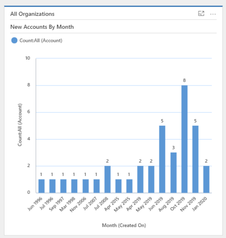
A chart always has a horizontal (or category) and a vertical (or series) axis. The vertical axis can only display numeric values – such as counts – where the horizontal axis can display non-numeric values as well. Charts can also be single-series charts or multi-series charts.
There are two types of charts: System and Personal Charts.
- System Charts can only be created by users with the security roles of System Administrator or System Customizer. These charts are visible to all users and can be customized by going on to the Settings area and customizing the system. System Charts can then be included to System Dashboards.
- Personal Charts can only be seen by the users that create them or the ones to whom these charts are shared with. These charts can only be shared if the owner has sharing privileges.
The charts are usually created from an existing view and will, therefore, used the filtered data of the view – if any filters are applied. But charts can also be based on Fetch XML queries. It enables to display N:N relationships for example. The XrmToolbox plugin Advanced Chart Editor is useful to customize charts.
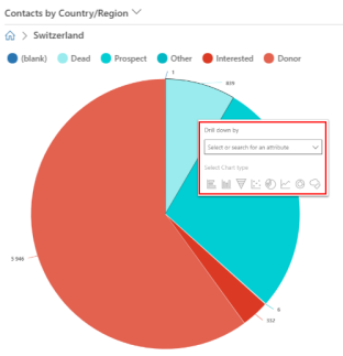
Dynamics 365 offers a powerful tool within charts: the drill-down feature. By clicking on a section of the chart – for example on a slice of a pie chart – a pop-up will appear enabling the user to create a new chart from the data of the clicked section. A drill-down chart can also be drill-downed, giving users absolute control of the data and the type of chart to use.
Examples
As explained above, System Charts are created directly from the Customizations part of Dynamics 365.
Some points:
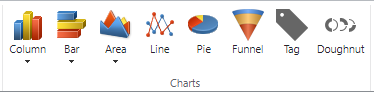
- As of 2020, there are seven types of charts available:
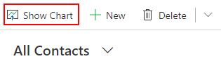
- For Personal Charts, while opening a view, the Show Chart button will be displayed on the top left of the view ribbon.
- On the classic interface, there is no Show Chart button, but a panel is available on the right part of a view.

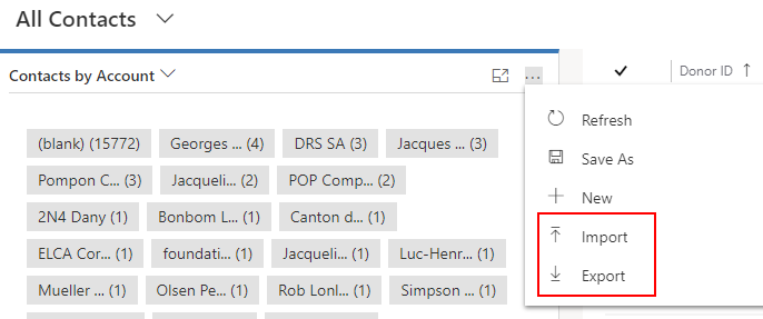
- Note that Charts can be exported and imported.
Take-away Points
- Charts enable a visual representation of records in Dynamics 365.
- Data is always up-to-date.
- Every user can create their own charts and share them with colleagues.
- FetchXML queries can be used to retrieve more complex data.
References
- https://docs.microsoft.com/en-us/dynamics365/customerengagement/on-premises/developer/customize-dev/customize-visualizations-dashboards
- https://www.crmdynamics.com/dynamics-365-charts-dashboards/
- https://www.websan.com/blog/item/739-data-visualization-tools-in-dynamics-365-dashboards-views-charts