Microsoft announced the release of the new Fluent UI Controls for PowerApps.
The main idea of this improvement is to have a default design much closer to the modern Microsoft patterns and styles.
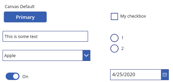
Here you can have a look of the current design of a bunch of controls:

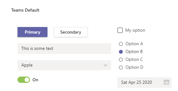
And you can compare them with the new design:

With the current version, if you wanted to have this kind of result, you would have to do difficult kind of customization (For example to have a shadow on your buttons). It will be a real gain of time starting from this design.
This is a quick view of some controls that have been updated but there will be a lot more controls improvement next. You can find the list of updated controls here.
Sources :
https://powerapps.microsoft.com/en-us/blog/modern-fluent-ui-controls-in-power-apps-preview/

